Background
As the cryptocurrency platform experienced rapid user growth, the company recognized the critical need to enhance the user experience and interface design. Our team was brought in to conduct a comprehensive redesign that would not only improve usability but also elevate the overall product experience.
Scope of Revamp
Visual and Interaction Design
Implement Dark/Light Mode
Update colour system
Update icon system
Refine motion design
Core Functionality:
Asset Management Flow
Earn Flow
Challenge
Our redesign focuses on creating a flexible design system that supports future platform growth. By developing a comprehensive color palette, icon system, and motion guidelines, we aim to create an interface that serves both novice and experienced crypto users.
Key objectives
Expand market reach
Maintain existing user workflows
Provide an intuitive, scalable platform design
Solution & Direction
Usability test on Existing Development
Faced with limited initial guidance, I conducted a comprehensive usability test of the mobile app. The research covered every app interaction, involving 12+ user testing interviews to gather in-depth user feedback. During these sessions, I documented:
User action expectations
Visual design suggestions
Points of user confusion
Example of problem research — UX suggestion
Example of problem research — VisualSuggestion
Through systematic testing of each function, I spotted and cataloged existing user experience challenges. These findings were then organised into three distinct problem categories:
UX Suggestion
Visual Suggestion
Motion Suggestion
Refinement Process
Example 1 — Icon Style Refinement

Existing icon group issues
❌
Too many style of icon make the UI seems not consistence
❌
Size and colour of the icon is not readable
❌
Current icon set is not light mode friendly
To elevate the overall user experience, we standardized the icon style with clear guidelines.

When implementing the dark/light mode functionality, we carefully selected a neutral grey palette (#8598A7) and highlight green (#00A48F) that works effectively in both themes.
Example 2— Detail icon refinement
The app suffered from inconsistent UI management, resulting in varied icon usage throughout the interface.
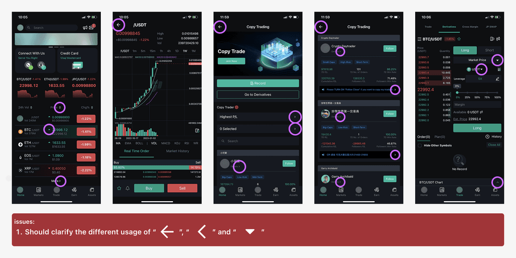
Directional indicators such as arrows, chevrons, and carets play a crucial role in guiding user actions and navigation. Standardizing these elements was essential to create a more intuitive and seamless user experience.

We analyzed the existing icon usage patterns and developed a comprehensive comparison table outlining our recommended implementation. Our strategy focused on two key principles:

Using a single, consistent icon to represent each specific user behavior
Applying one cohesive icon family across related action behaviors
Despite being a seemingly minor modification, the icon standardization significantly enhanced the product's overall coherence.
The refined action indicators now provide clear visual guidance, allowing users to intuitively anticipate next steps when encountering specific icons throughout the interface.
Example 3— Dark/ Light mode implement
Using Figma's color selection tools, we tested various color combinations directly on the existing UI.


- UI elements
- interactive states
- functional components.
Result & Conclusion
After organising the visual elements and standardising the design guidelines, we revamped the Asset and Earn functions. The revamp significantly enhances the user experience by improving navigation, visual hierarchy, and overall aesthetics.

The introduction of a card layout and an updated tab menu streamlines information access, making it more intuitive for users.
Enlarged and highlighted action buttons simplify interactions with key functions, ensuring that users can efficiently manage their assets.
Example of Asset Revamp
Example of Earn Revamp
Overall, these design enhancements result in a more engaging and effective tool for users, facilitating smoother blockchain transactions.