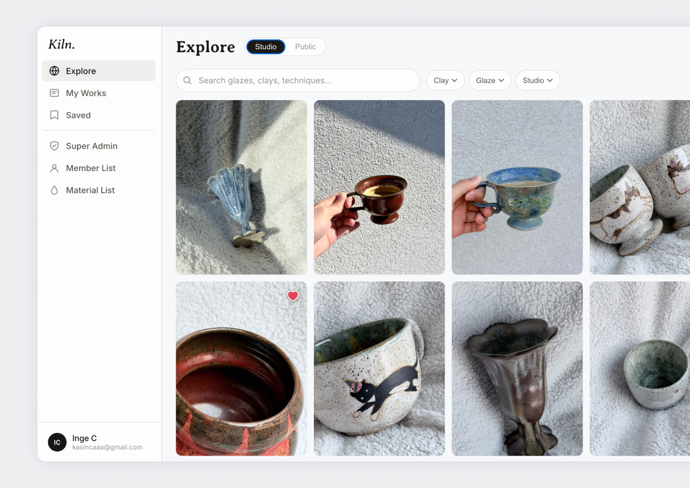
The problem
I started Kiln because I wanted to know what everyone else was putting on their pots.
Glaze combinations are hard to research. You can search online, find a result you like, and get almost nothing you can use: the studio that fired it was working at a different cone, with glazes from a different supplier, over a clay body you can’t buy. The reference that actually helps comes from someone standing at the same kiln as you, dipping out of the same buckets, firing to the same cone. That’s why the real method is asking a studio-mate, and why the answer usually lives in their camera roll.
- Logging a piece the moment it leaves the kiln: clay body, glaze layers in order, cone.
- The same piece later, browsable with its full firing history intact.
So the first version was for my own studio. Log a piece with its photo the moment it leaves the kiln, and the studio’s own history becomes something you can browse instead of something scattered across everyone’s phone and a few paper notebooks.
Designing around the material
The obvious build for a “tracking” product is a form and a table. Glaze results resist that. The whole point is the colour, and “SC-16” on its own tells a potter nothing.
So every glaze and clay body carries a colour swatch, shown as a small dot wherever its name appears: on cards, in the detail view, inside the picker itself. That last one forced a real interaction decision, since a native <select> can’t render a swatch next to an option. The pickers became a custom component with typed search and free-text entry. More work to build, but it kept the one piece of information potters actually scan for.
- The commercial glaze catalog: brand, code, and name, each with its swatch shown first.
- The same treatment on the clay catalog, alongside type, cone, and region.
The same logic shaped the entry cards. At rest, a card is only the photo, with no title or tags sitting on top of the piece. Hovering (or tapping, on mobile) reveals the glaze layers and clay body on a frosted-glass overlay, so browsing the Explore gallery feels closer to flipping through a lookbook than scanning a spreadsheet. The metadata is there when you want it and invisible when you don’t.
Structure that matches how a studio is actually run
I showed it to pottery friends, and it stopped being a personal project fairly quickly. Two studios, one in Vancouver and one in Hong Kong, now want to use it to manage their members’ work. A tool for recording my own firings is a single-user app with a nice gallery. A tool two studios run their memberships on needs members, the studio’s own glaze and clay lists, gallery visibility preferences, region, and settings for each studio’s way of working, and the two of them don’t operate the same way.
The three tiers (Super Admin, Studio Admin, Member) are the foundation for that, and they map onto how a ceramics studio already runs. Someone owns the studio’s official glaze and clay list, individual members own their own entries, and a studio decides whether its members’ work appears in the public Explore gallery at all. The permissions exist so the studio can keep one shared materials list without a member accidentally deleting someone else’s history.
The day-to-day flows stay forgiving. Adding a batch of pieces is a two-step wizard, photos first and details after, and if someone runs out of time or information partway through, incomplete items save quietly as private drafts instead of blocking the whole batch. That matches how people actually work after a firing: rushed, wet hands, six pieces at once, half of them properly labeled later.
What admin systems taught me
This is where the day job turned out to be directly useful. I worked on the Ninesmart booking system and the AMS admin product, both of which had to fit different business customers without becoming a different product for each one. The lesson from both was that the flexibility has to live in configuration, and that the configuration needs designing as carefully as the interface does. Get it wrong and every new customer is a code branch someone has to maintain forever.
So I’m building Kiln with that in mind from the start. The questions I keep coming back to are about the shape of the data rather than the screens: does this belong to the studio or to the member, which fields does a Studio Admin control and which ones does a member fill in, and what happens to a member’s existing entries when a studio changes its materials list. Labelling the studio-specific items correctly now is what makes it possible to add a third studio later without disturbing the two already running.
Building for people who aren’t me
This is the first side project likely to have real users on it, which raises the stakes on things I could previously ignore. The database has to hold up under a lot of members uploading a lot of images, text, and settings, and a studio that loses a member’s firing history has lost something they can’t recreate.
So a good share of the recent work has been QA and account testing across the three roles, hunting for the bugs before a studio finds them. It’s still in progress, with release targeted for 2027.
Mobile as the primary surface
A ceramics studio is not a desk. Most of this gets used standing at a table with clay-dusty or wet hands and a phone propped against something, which pushed mobile from a responsive pass to its own design problem: a bottom tab bar instead of a sidebar, the add-entry wizard opening full-screen instead of as a dialog, swipe gestures to browse a piece’s photos, and a save button that stays reachable without hunting for a hover state that doesn’t exist on a touchscreen.
Visual identity
The interface stays out of the way: a warm neutral palette with hairline borders instead of card shadows, so nothing competes with the ceramic photography. Colour belongs to the glazes and clays being documented, and the UI is close to monochrome. Type pairs Inter for interface text with Averia Serif Libre for titles, a small nod to craft in an otherwise utilitarian tool.
What I’d still explore
Studio Admins can grant admin access to a member, but there’s no UI yet to see who holds it or take it away. That’s a real gap once a studio has been running for a while and roles change. I’m also unsure about the canvas-rendered swatch-only cards (entries with no photo yet), and whether their contrast survives the same hover overlay used everywhere else.
Progress log
Newest first.
Sep 2026 — Role-based access control
Added Super Admin, Studio Admin, and Member tiers so a studio’s shared materials list and its members’ individual work can coexist safely. Known gap: no UI yet to see or revoke an admin grant once it’s made.
Aug–Sep 2026 — Commercial materials catalog
Replaced a 19-item placeholder glaze list with 610 real entries across four brands, added a ~100-body clay catalog sourced from real suppliers, and gave every material a colour swatch, parsed from its name where possible and overridden by hand when the name gave no hint (looking at you, “Dragon’s Eye”).
Aug 2026 — Mobile, properly
Rebuilt as its own experience instead of a squeezed breakpoint: bottom tab bar, full-screen modals and wizard, swipe carousels, plus a pile of iOS Safari fixes for a dynamic toolbar that kept resetting scroll position mid-browse.
Aug 2026 — Design system overhaul
Moved to the current warm neutral, border-first palette and the Inter/Averia Serif Libre pairing, keeping colour on the ceramics and off the interface.